
安卓主题参数变量介绍(英文)
此文档来源于 项目
While creating themes for Android Telegram, you can find elements which variable you don't know, or variables you don't know what they change. Worse yet, there are no descriptions of the variables in the in-app editor, so you have to ask someone who knows more about theming than you.
We started creating this glossary in order to collect variable descriptions in one place. The glossary already has descriptions of many variables, but much more are still to be described. And you can help to make it even better!
Every part of the glossary is free software. The source code of the website is available on GitLab here, and the most important part — the database — is available on GitLab here. You can contribute to these parts by opening merge requests against the repositories above, and once your merge request is merged, you can instantly see your contribution live!
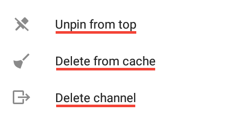
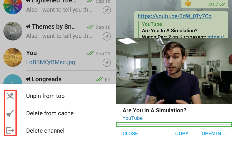
Backgrounds
The red areas show windowBackgroundWhite and the green areas show windowBackgroundGray.
Example of an image and a color as a chat screen wallpaper.
Chat Screen
Bubbles
The red area shows chat_selectedBackground.
Message panel
The red area shows chat_messagePanelBackground, the green area shows chat_messagePanelHint, the dark blue area shows chat_messagePanelText, the orange area shows chat_messagePanelSend, the light blue area shows chat_messagePanelIcons, and the brown underline shows chat_fieldOverlayText (example of a channel).
Emojis/stickers panel
If you change the variables from this subsection with the in-app editor, you need to reopen the chat screen to see changes.
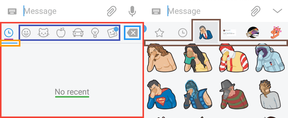
The red area shows chat_emojiPanelBackground, the green underline shows chat_emojiPanelEmptyText, the dark blue area shows chat_emojiPanelIcon, the purple underline shows chat_emojiPanelIconSelected, the orange area shows chat_emojiPanelIconSelector, the light blue area shows chat_emojiPanelBackspace, and the brown area shows chat_emojiPanelStickerPackSelector.
Unfortunately, the next five variables can be changed only with .attheme editor.
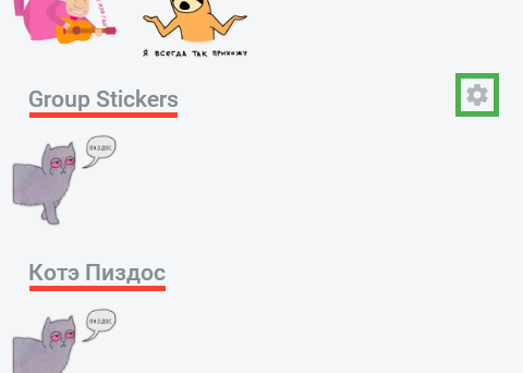
The red underline shows chat_emojiPanelStickerSetName and the green area shows chat_emojiPanelStickerSetNameIcon.
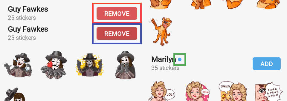
The red area shows featuredStickers_delButton, the dark blue area shows featuredStickers_delButtonPressed, and the green area shows featuredStickers_unread.
Bot keyboard
The background is chat_emojiPanelBackground.
The red underlines show chat_botKeyboardButtonText, the dark blue areas show chat_botKeyboardButtonBackground, and the green area shows chat_botKeyboardButtonBackgroundPressed.
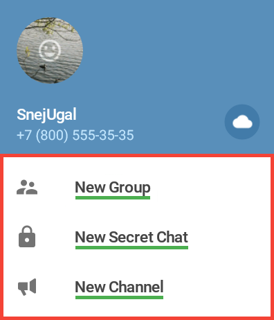
Contacts
The next two variables are used not only in Contacts, but primarily they are seen here.
Red — graySection, green — windowBackgroundWhiteIcon.
Fast scroll
Green — fastScrollInactive, red — fastScrollActive, orange — fastScrollText.
“Invite friends” screen
Red — contacts_inviteBackground, yellow — contacts_inviteText.
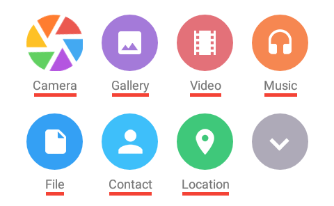
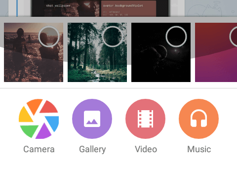
Attach Screens
This part of glossary is about attach screens.
Files
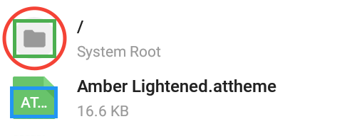
Green — files_folderIcon, red — files_folderIconBackground, blue — files_iconText.
Location
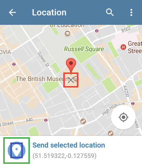
Red — location_markerX, green — location_sendLocationBackground, blue — location_sendLocationIcon.
Music
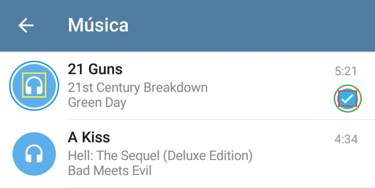
Blue — musicPicker_buttonBackground, yellow — musicPicker_buttonIcon, green — musicPicker_checkbox, red — musicPicker_checkbox.
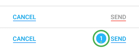
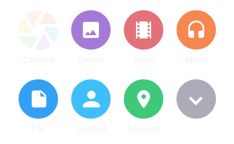
Green — picker_badge, yellow — picker_badgeText, red — picker_disabledButton, blue — picker_enabledButton.
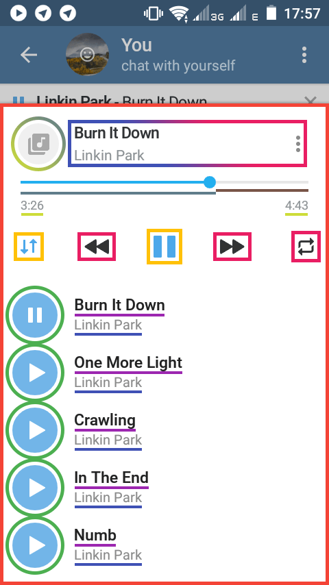
In-app Music Player
The in-app editor opener button is overlaid when you open the editor. All player variables are available on the chats list screen, or you can use .attheme editor to change the variables.
Action bar
If you tap the top-left icon, you'll see an old-like player with action bar. It also appears when the playlist is big and you scroll the list.
The red area shows player_actionBar, the purple areas show player_actionBarItems”, the yellow area shows player_actionBarTop, the blue circle shows player_actionBarSelector, the green underline shows player_actionBarTitle, and the orange underline shows player_actionBarSubtitle.
Playlist panel
For the blue-to-pink area, see the Action Bar subsection.
For the gray-to-green area, see the Placeholder subsection.
Seekbar
The list
This subsection doesn't describe new variables, these variables aren't used only here, their primary usage can be found in other sections of the glossary.
The red area shows player_background, the blue gray underline shows player_progress, the brown underline shows player_progressBackground, the lime underlines show player_time, the orange areas show player_buttonActive, the pink areas show player_buttonActive, the purple underlines show windowBackgroundWhiteBlackText, the blue underlines show windowBackgroundWhiteGrayText2, the green circles show chat_inLoader. For gradient-stroked areas see the top of this subsection.
Placeholder
You see the placeholder when the track doesn't have a cover.
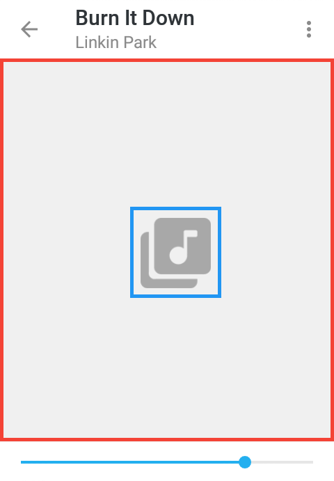
The red area shows player_placeholderBackground and the blue area shows player_placeholder.
Top panel
When you start playing a track or a voice message, a panel at the top and below the action bar with audio controls appears. This subsection is about this panel.
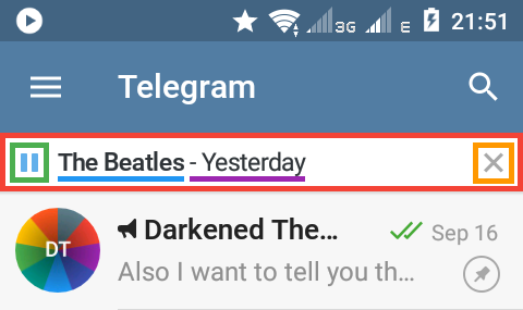
The red area shows inappPlayerbackground, the green area shows inappPlayerPlayPause, the orange area shows inappPlayerClose, the blue underline shows inappPlayerPerformer, and the purple area shows inappPlayerTitle.
Note by @Ra1nb0wD4sh: inappPlayerClose affects the color of the 2x playback toggle (appeared in 4.8.10) while it's in disabled state. inappPlayerPlayPause affects the color it has when enabled.
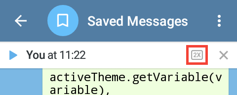
The 2x playback toggle
Settings
The red area shows windowBackgroundGrayShadow.
Icons
The red area shows chagephoneinfo_image and the green area shows sessions_devicesImage.
Stickers and Themes sections
The blue area shows stickers_menu and the red area shows stickers_menuSelector.
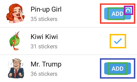
The red area shows featuredStickers_addButton, the blue area shows featuredStickers_addButtonSelected, the green areas show featuredStickers_buttonText, the orange area shows featuredStickers_addedIcon, the purple area shows featuredStickers_buttonProgress.
Obsolete variables
These variables once were used, but now they've been removed from Telegram because their elements were removed or replaced with other variables.
listSelector— it was merged withlistSelectorSDK21;player_seekBarBackground— the element was removed;player_duration— the element was merged withplayer_time.
Text
The red areas show windowBackgroundWhiteBlackText.
Gray text
The red area at the top shows windowBackgroundWhiteGrayText, the purple area shows windowBackgroundWhiteGrayText2, the dark blue area shows windowBackgroundWhiteGrayText3, the light blue area shows windowBackgroundWhiteGrayText4, the green area shows windowBackgroundWhiteGrayText5, the yellow area shows windowBackgroundWhiteGrayText6, the pink area at the bottom shows windowBackgroundWhiteGrayText7, and the brown area shows windowBackgroundWhiteGrayText8.
Red text
The red area shows windowBackgroundWhiteRedText, the dark blue area shows windowBackgroundWhiteRedText2, the green area shows windowBackgroundWhiteRedText3, the purple area shows windowBackgroundWhiteRedText4, the light blue area shows windowBackgroundWhiteRedText5, and the yellow area shows windowBackgroundWhiteRedText6.
Green text
The red area shows windowBackgroundWhiteGreenText and the blue area shows windowBackgroundWhiteGreenText2.
Blue text
The red area shows windowBackgroundWhiteBlueHeader, the purple area shows windowBackgroundWhiteBlueText, the dark blue area shows windowBackgroundWhiteBlueText3, the light blue areas show windowBackgroundWhiteBlueText4, the green area shows windowBackgroundWhiteBlueText5, the light orange area is windowBackgroundWhiteBlueText6, the teal area shows windowBackgroundWhiteBlueText7, the light green one shows windowBackgroundWhiteValueText, and the dark orange area shows windowBackgroundWhiteLinkText.

The red area shows windowBackgroundWhiteLinkSelection.
Controls
Text fields
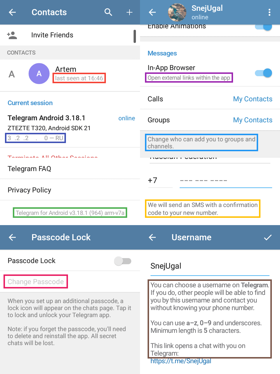
Like the field in Settings → Username.
- Entered text color is set by
windowBackgroundWhiteBlackText.
The red area shows windowBackgroundWhiteHintText, the blue area shows windowBackgroundWhiteInputField, and the green area shows windowBackgroundWhiteInputFieldActivated.
Switch
Like in Settings.
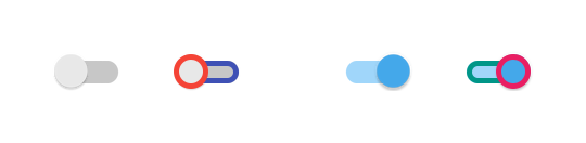
The red area shows switchThumb, the blue area shows switchTrack, the green area shows switchTrackChecked, and the pink area shows switchThumbChecked.
Checkbox
Like in Chat info → Notifications → Customize.

The red area shows checkboxSquareUnchecked, the blue area shows checkboxSquareBackground, the green area shows checkboxSquareCheck, and the orange area shows checkboxSquareDisabled.
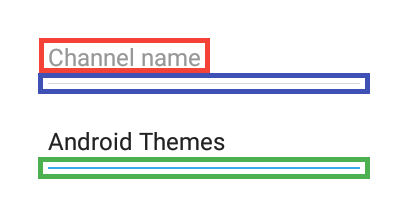
Openable list control
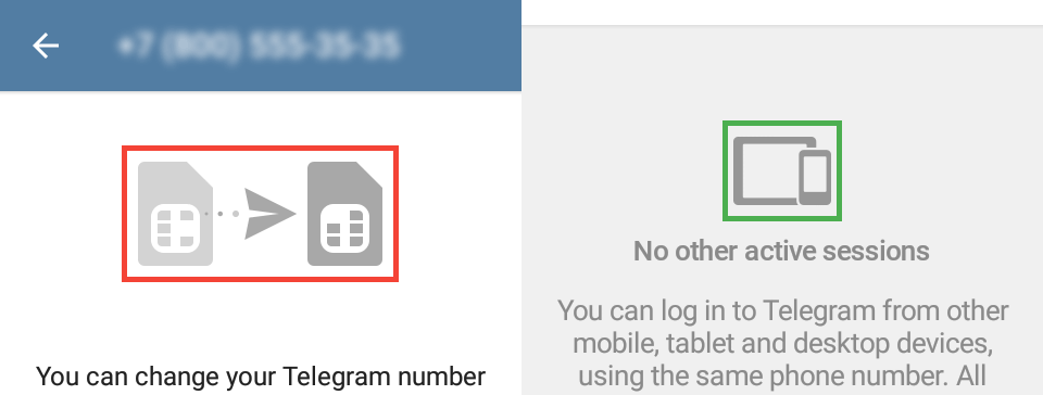
Like your country's name in Settings → Phone → Change Number.
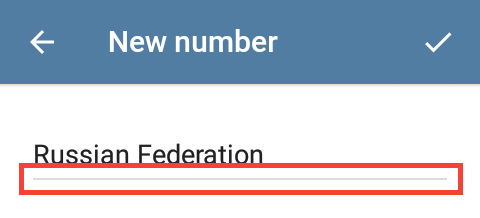
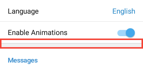
The red area shows windowBackgroundGrayLine.
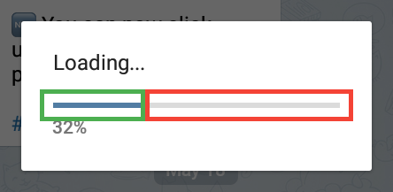
Progress indicators
The red area shows contextProgressInner1 and contextProgressOuter1, the green area shows contextProgressInner2 and contextProgressOuter2, he purple area shows contextProgressInner3 and contextProgressOuter3, and the orange area shows login_progressInner and login_progressOuter.
The red area shows progressCircle.
Profile screen

The red area shows profile_actionBackground, the orange area shows profile_actionPressedBackground, and the green area shows profile_actionIcon.
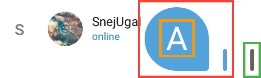
Avatars
If a user doesn't have a profile picture or it's not loaded yet, a colored circle with a random color and one or two letters will be shown.
Lists
The red area shows divider, the blue area shows listSelectorSDK21, and the green area shows emptyListPlaceholder.
Chats list
General variables
The blue underline shows chats_message, the orange underline shows chats_date, the red underline shows chats_nameMessage, the light green underline shows chats_actionMessage, the dark green line shows chats_attachMessage, and the purple line shows chats_draft.
Typical chats
The red underline shows chats_nameIcon and the green line shows chats_name.
Secret chats
The red underline shows chats_secretIcon and the blue underline shows chats_secretName.
Unread counter
Note: the “@” mention icon cannot be changed for unknown reasons.
The red area shows chats_unreadCounter, the green area shows chats_unreadCounterMuted, and the purple area shows chats_unreadCounterText.
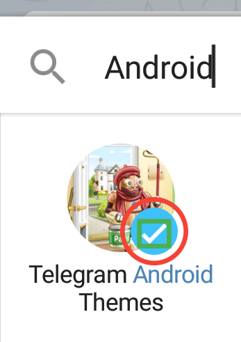
Verified icon

An example of a verified icon.
“Send message” button
The red area is chats_actionBackground, the green area is chats_actionPressedBackground, and the yellow area is chats_actionIcon.
Left menu
The selector on this menu is listSelectorSDK21, because the menu is a list.
The red area shows chats_menuBackground and the green underlines show chats_menuItemText.
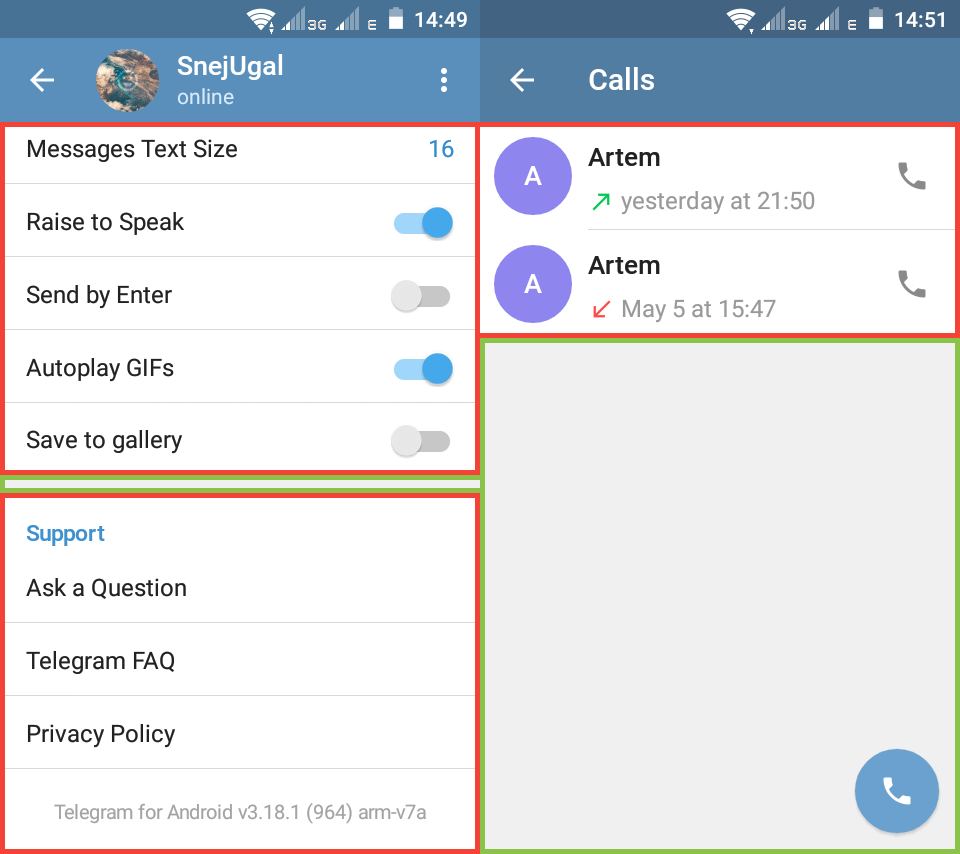
Calls
Calls log
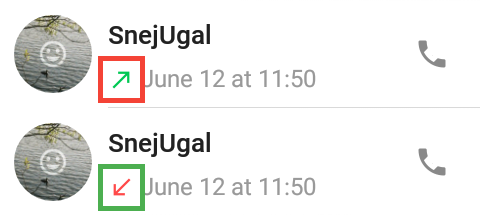
The red area shows calls_callReceivedGreenIcon, the green area shows calls_callReceivedRedIcon.
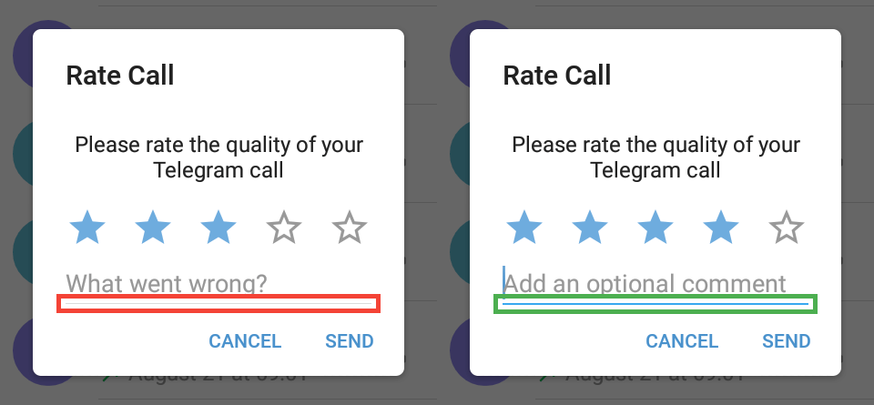
“Rate the quality” prompt
After you had a call and the call was ended, a “Rate the quality” prompt will appear. You may also force the prompt to appear if you go to Calls log, hold a history item and tap “Rate call”. Unfortunately, you can edit elements of the prompt only with .attheme editor.
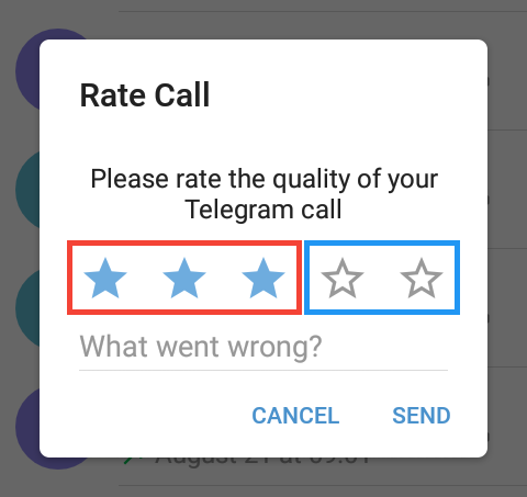
The red area shows calls_ratingStarSelected, the blue area shows calls_ratingStar.
Action bar
Default mode
The red area shows actionBarDefault, the light blue area shows actionBarDefaultIcon, the yellow area shows actionBarDefaultTitle, the green area shows actionBarDefaultSelector, and the orange area shows actionBarDefaultSubtitle.
Action mode
Action mode is the top bar dialog that opens when either chat bubbles get selected for reply, forwarding or edit or selecting shared files, music or link posts in chat shared media or attaching files in the message panel.
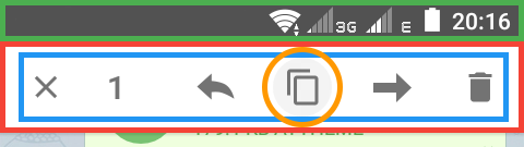
The red area shows actionBarActionModeDefault, the green area shows actionBarActionModeDefaultTop, the blue area shows actionBarActionModeDefaultIcon, and the orange area shows actionBarActionModeDefaultSelector.
Submenu
Submenu is the menu that appears when you tap the three dots icon on the action bar.
Note: the submenu in Photo Viewer depended on the variables below before, but doesn't anymore.
The red area shows actionBarDefaultSubmenuBackground and the blue area shows actionBarDefaultSubmenuItem.
Search
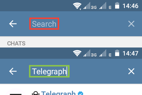
The red area shows actionBarDefaultSearchPlaceholder, the green area shows actionBarDefaultSearch.
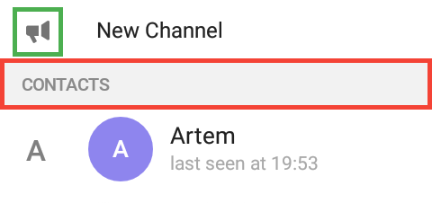
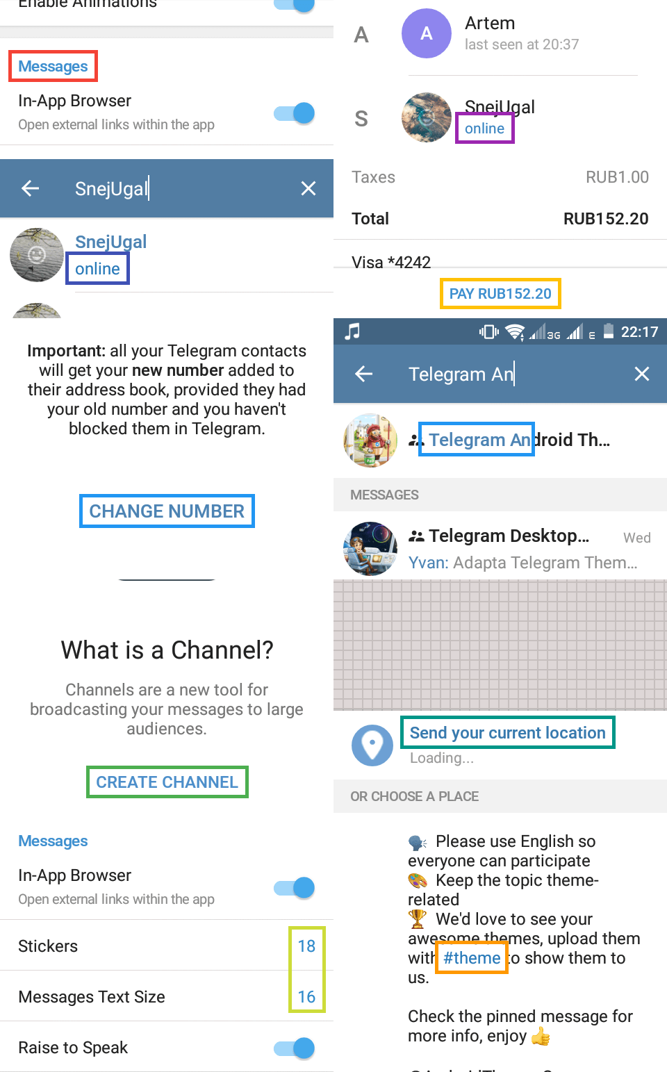
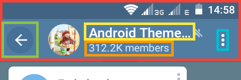
“What is a channel?” screen
The “What is a channel?” screen appears when you try to create a new channel if you didn't create any. If you did, you can change the variable only with .attheme editor.

The red area shows actionBarWhiteSelector.
Dialogs
Dialogs are the panels at the bottom or in the middle of the screen. For example, the one that appears when you tap a message or that one that appears when you hold a chat on the chat list.
Backgrounds
The red area shows dialogBackground and the green area shows dialogBackgroundGray.
Text
The red underlines show dialogTextBlack.
The red underlines show dialogTextGray2.
Blue text
The red underlines show dialogTextBlack.
Decorative elements
The red area shows dialogIcon and the green area shows dialogGrayLine.
Badge
The red area shows dialogBadgeBackground and the green area shows dialogBadgeText.
Controls
Buttons
The red underlines show dialogButton and the green area shows dialogButtonSelector.
Radio buttons
They should set radio buttons colors on dialogs, but they don't for some unknown reasons.
Square checkboxes
Set the same elements of the square checkboxes but on dialogs.
The red area shows dialogCheckboxSquareUnchecked, the blue area shows dialogCheckboxSquareBackground, the green area shows dialogCheckboxSquareCheck, and the orange area shows dialogCheckboxSquareDisabled (note that it is how a disabled checkbox may look like, but we're not sure about that because we don't know where it is used).
Round checkboxes
The red area shows dialogRoundCheckBox and the green area shows dialogRoundCheckBoxCheck.
Text fields
The red area shows dialogInputField and the green area shows dialogInputFieldActivated.
Progress indicators
The red area shows dialogLineProgressBackground and the green area shows dialogLineProgress.
Attach panel
The black glow is dialogScrollGlow. In the default theme, it is white, and on this example image, it was made black, so one can clearly see it.
Next variables set the background color of attach buttons.
Next variables set the icon color of attach buttons.
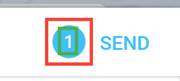
The buttons' backgrounds are changed by chat_attach*Background and their icons are changed by chat_attach*Icon.
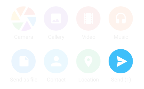
This button is chat_attachSendBackground (it shows when you select at least one photo to send).
Next variables set the colors of the “leaves” of the camera icon, in the clockwise direction.
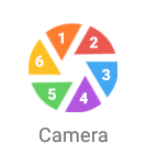
The numbers show where each “leaf” of the icon is.
- The color of descriptions below buttons is
dialogTextGray2.